Sunday, October 30, 2011

Liquid Container

The Liquid container project was two projects ago, I believe. So far it has been my least favorite project out of all of them. I truly hated drafting this odd coffee pot or tea brewer. I'm not quite sure what it really is.  Although it was hard and brought on a lot of long nights I do believe in the end that it was worth it.

Here is the container itself. 

Our first assignment of this project called for orthographic projection of the container in elevation, plan and section. 
I did end up making a couple of errors on this. The first being the length of the support holder within the pot which is in the center of the Arches Paper. The second error being the distance between the right, side elevation and the center front elevation.

The second part of the assignment called for us to use orthographic projection with the container to tell a story of how it works. 

Here is my second Arches
The story is (from left to right): the pot sits idle waiting to be used, water is added with the lid off along with coffee grounds, the lid is returned with the pot being tilted ready to be poured, the pot is pouring coffee, and finally, the pot sits with the lid removed with a small of amount of coffee remaining ready to be cleaned.

On this Arches the pot is shown (from left to right): side elevation, section, front elevation, an expansion of all the parts of the pot from empty container, to support stand, to grounds lid, to grounds container, to pot lid, in plan, elevation, plan, elevation, plan; side elevation again for the next picture and finally back elevation.


Saturday, October 29, 2011

Site Geometry

The project directly before the chair was Assignment 6: Geometry in the field. For this project we worked in groups of two or three(I worked with Brian who I am working on the chair with and Dan, another person in my studio group). We were required to pick a spot on campus and create a design using only the materials available on the site.

Our first step was to pick the site. For this we chose the area around the Carr Memorial Chapel, more commonly referred to as the "God Box" which was designed by Mies van der rohe.

We soon discovered that the actual floor plan of the God Box is a perfect golden rectangle. Seeing as the project required us to respond to the site we responded with making a giant golden ratio/mean.

This is a simple plan rendering done by Dan to show what we were going to do. We used this photo on iPads during our presentation to help people see the whole site. 
The God Box is the upper rectangle with the actual site below it

The first step in all of this was taking precise measurements along with calculating a lot of math. Once those could be done we began placing construction lines, just as if we were drafting.
We achieved this by wrapping string around sticks along our predetermined path. 
To make sure we didn't step on these sticks we flagged them all with blue masking tape.

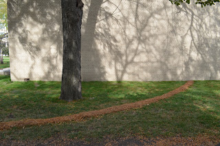
As it can be seen the main material at our disposal were leaves. It was then that we decided that since we are doing one, bold shape why not use one material.

Our next step was placing the leaves inside our lines.

From there, once we were done we completely covered the entire mean in trace paper. 

I am glad that we did because it did rain quite hard that night. The paper did get very damaged but the leaves themselves were perfect. 

The morning of the presentation we carefully removed the paper and construction lines and were left with this. 

Once completed the final product was this. It was hard to capture the whole mean in one photo. 


Friday, October 28, 2011

And they said it couldn't be done

Well here it is. Our full-scale proposal. It is the last step before the final chair is built and presented. Everyone told us that we would not be able to successfully create a cantilever out of cardboard(including our professor and our T.A.), but we proved them wrong, quite well. Although there are a couple of things that we need to adjust on the chair design, the cantilever is perfect. It is, after all the main focus of our chair.
Our area of focus for correction is mainly the back of the chair considering it is not functional for support on this design.
Another area to fix is the angle at which the seat sits on its own. We have to have it on an angle to give room to move when a person sits on it but not as extreme of an angle as it is now.

Here is Brian sitting in it, putting his full weight into it.

It is nine layers of cardboard thick, being held together by contact cement.

We were able to control the curve by scoring the pieces in a specific order and depth


Tuesday, October 25, 2011

3:1 Scale Proposal

Here it is. It isn't pretty, but it's very strong for just being a model. Of course, if this ends up being our design for the final chair it will be glued and built much more carefully. We both have our doubts that it might fully work in the end but we have ideas on how to fix/improve it.

Here's Brian working on the model
Here is the finished product. It is kind of messy in regards to the glue but it gets the point across.


Monday, October 24, 2011

Chairs, Chairs, Chairs

We finally reached the project I've been looking forward to all semester. The Cardboard Chair Project, or simply, Assignment 7: Chair. We have had 6 projects before this, but I have been too busy to post them, but I will get to them soon enough. Here are our(my studio partner Brian, and myself) three scaled proposals we presented to our professor today. 

They are all based off of Mies van der rohe's MR10.

Here is our first, one that just shows the structure of the chair.

The second is my favorite. It demonstrates the cantilever of the MR10 very well. 

Finally, our third, the strongest of the three(the model itself held 10 pounds quite well).
Although this is the strongest it will be the most difficult to build for a final design