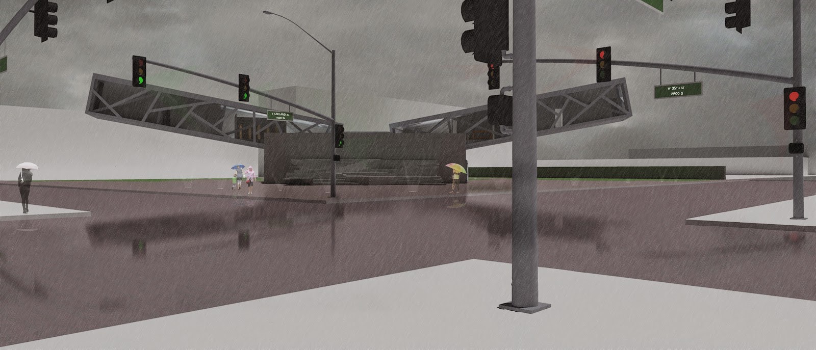
Third Year was a busy one. It was a time for me to start fresh, in a sense. I had spent second year and the summer feeling sorry for myself and it was getting me nowhere. The time had come to start working hard for anything I set my mind to. It was also a fresh start in the terms of studio. Here at the College of Architecture we started a new curriculum with our new dean and the heavy, technical-based studios were making way for new, better and smarter design-based studios.
The first semester was rather uneventful for studio. The projects failed to capture my interest and it grew difficult to put my heart and full effort into the projects at hand. At times it felt more to me like an art class rather than an architecture studio. This was going to be rocky seeing as it was a first time for all of us, even the professors on how to go about this new way of thinking in studio. It was a learning experience for everyone but one, looking back, that was overall helpful to changing my design approach and thinking.
My favorite project of mine from the fall semester of 2013 was a collage that I had to assemble, digitally focusing on the idea of "smoosh." This meant creating something new at a site in the city of Chicago and letting your creativity run with it. I won't bother to go into details about the meaning behind it, because the truth is there isn't much there, just an interesting picture at the end of the day.
The semester in a whole was a wash for me. I did not learn anything that I was hoping to. I felt that the collage above was the only thing worth sharing from the entire semester. Our final was to take an existing building that once was a school building. I was challenged to keep most of the original building in place and repurpose it. I dreaded every moment of it and by the end hated what I had pinned up. The review was the worst I ever had. I stood up there for 20 minutes or so and was told by 5 different people how bad my project was and I had to defend my work but in my head agreed with everything they were telling me and walked away feeling like I had wasted an entire semester.
Well, once January came around I was determined to make it better. To actually push myself and produce work that might be out of my comfort zone. I knew it was going to be hard but I had to not keep hating my work and wasting my time. Our project was a semester-long design of a building that served as a place for the people of the area and reflected their culture.
My area to assemble culture was McKinley Park, a neighborhood in the city of Chicago. Once research was completed I had found that it has always been an area of changing industries. I needed to create a building, in my eyes, that would stand for the next industrial revolution, that of the hackers and the makers. This building had to be like nothing that I had ever attempted before and had to be something that was like no other building, otherwise, why continue with architecture?
But how can I fill such a tall order for myself?
Simple, I had to make sure my work would be better than all the other work around me.
How do I start that with just research?
Make my graphics the best, without losing the information to images.
I decided to develop a color scheme that would carry throughout the entire project.
If my building was to be different and cool, then so had to be the ways and means that I justified every action I took with the building.
So, to the design.
What is the most different way I can plan a building?
Make something that will be too extreme and pull it back. Start with what I want and work in the reality of architectural limits.
I had chosen to focus on a cantilever to draw people into the entrance, but can it get more interesting than a box?
Then, as my professor examined a model I produced of this, she picked it up and turned it upside-down and set in back on the table and said that it was more interesting that way, so basically two cantilevers.
But my info graphs are only going to get me so far. Can I also try to make my renderings, something I wasn't good at better?
Not really the best, but I can come back to those once I have my design figured out.
After weeks of pushing to create a building with two cantilevers that worked with my program I felt that I achieved creating something beyond what I was capable of. It has received mixed reviews because it is, as I believe, truly different.
But can I also model the ideas I want to have in the building too?
Masses
Light Control
Embodying the Neighborhood
Uncommon Adjacencies
Programmatic Connections
Now time to execute them as a building.
These sections show the core shape I was trying to achieve.
My end result is something that I am very proud to have my name on.
Back to those graphics. I really want to set them apart from the rest.
In the end I achieved what I wanted to, and have been able to apply this thought process to other areas of design, hoping to push myself further and further, bettering my work and design along the way.


Hey! Update your blog with this year's stuff too. Make it a good year. Make it simply everything...and more.
ReplyDeleteFariha